How To Come Up With A Logo For A Rug Business

Are you having a hard time making custom logo rugs for your rug business?
Even if you don’t know what to do, that’s a good sign. Too many companies just slap together a logo without much thought. This usually gives them a logo that doesn’t fit with their brand, which they quickly come to regret.
Your logo is a picture of your brand, so you should put a lot of thought into making it.
But you shouldn’t stay in the same place for too long. At some point, you have to put something out there so that your customers can start to recognize and connect with your business.
Let’s look at what you need to know to make a great logo for your rug business:
Think About Who You’re Writing For
People who buy rugs are not the only ones who buy from you.
To make the best logo, you should think about what makes your customers special. If you know what makes them different, you can make a logo that speaks to them on a personal level.
Before you write anything down, spend some time getting to know the demographics of the people you want to reach. For example, if your rug business is popular with young people, you might want to make a logo with bright colors and cool shapes.
If your customers tend to be older, you might want to choose a logo with bigger text.
Make Sure The Style Fits Your Business
You need to make sure that the style of your logo matches the type of rugs you sell.
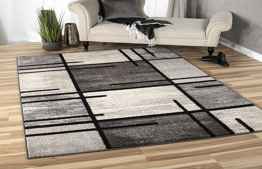
Now, this doesn’t mean that you have to make your logo look like a rug. But the design of your logo and the design of your rugs should match so that customers know what you’re all about.
For example, if you only sell oriental rugs, you’ll probably want a design with clean lines and muted colors. If you sell colorful, shaggy rugs, you should choose a bolder design.
Keep Things Easy
On the rugs you sell, you probably see all kinds of strange and complicated patterns.
But a design that looks great on the floor of someone’s bedroom might not look so good on a business card.
Your logo will be in small print a lot: on your website, on company packaging, on the company clothing, and on business cards.
So, you should keep things simple. If a logo has too many details, it will look cluttered and messy when it is small.
Consider Color
Color is a big part of how people look at your logo.
This is because different colors make people feel different things. People often think that red means passion, yellow means happiness, and black means sophistication.
Before you choose colors, you should think about what you want to say to your audience.
Look At The Other Teams
Checking out the logos of your competitors is a great way to see what works and what doesn’t.
It will help you narrow down your design so that it stands out and is easy to remember. It will also help you make sure you aren’t copying someone else’s design.


